Analysis of Breast Cancer data - 2
Analysing breast cancer data using Multi dimensional Scaling and Parallel Co-ordinates Plot
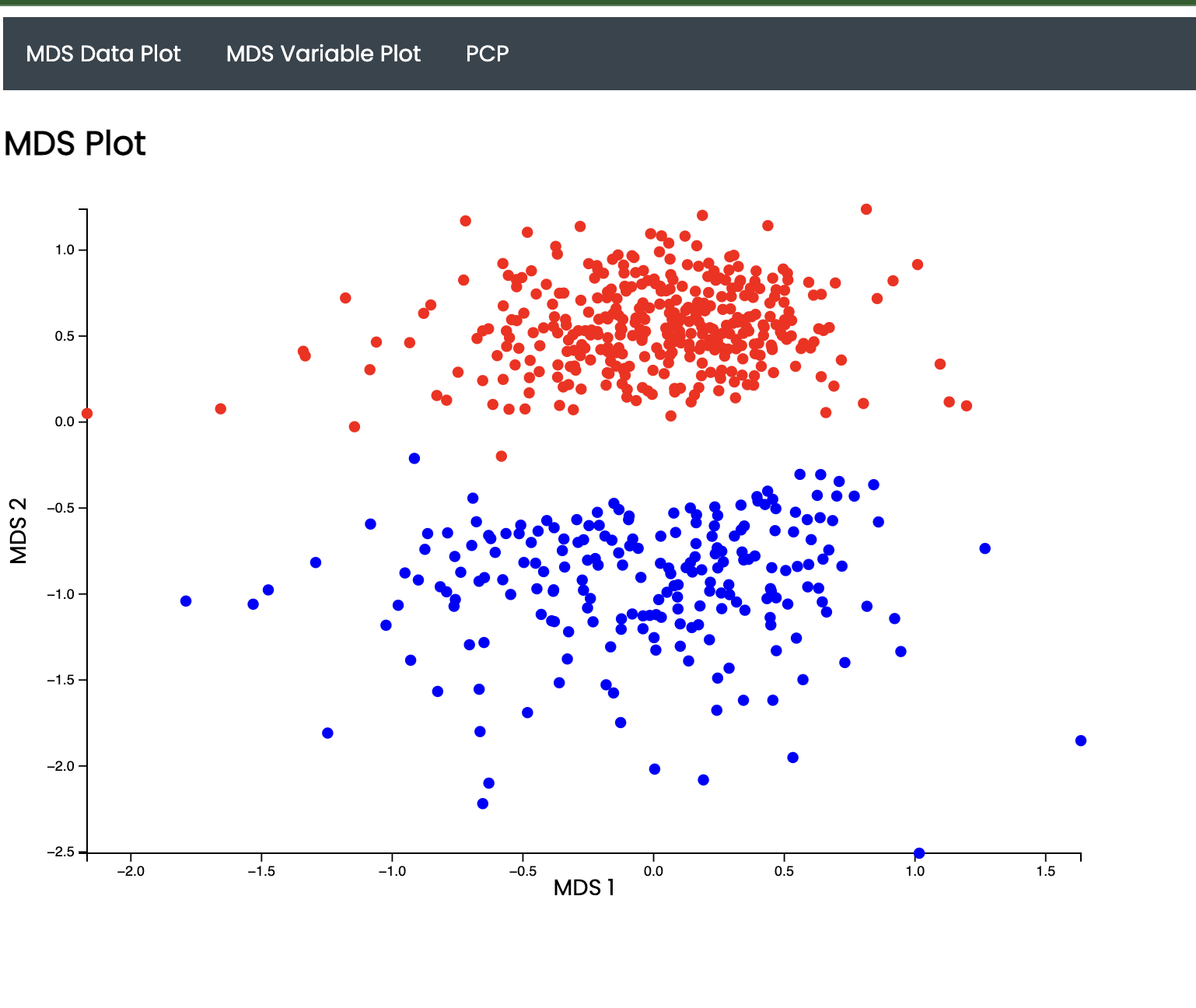
I have a dataset with 31 attributes. I’ve performed Multi Dimensional Scaling (MDS). I’ve visualised the results using D3.js and used Flask for the backend. The axes represent the 2 components. The colors represent the clusters. I have performed K-Means on the N-Dimensional space and visualised the clusters here.


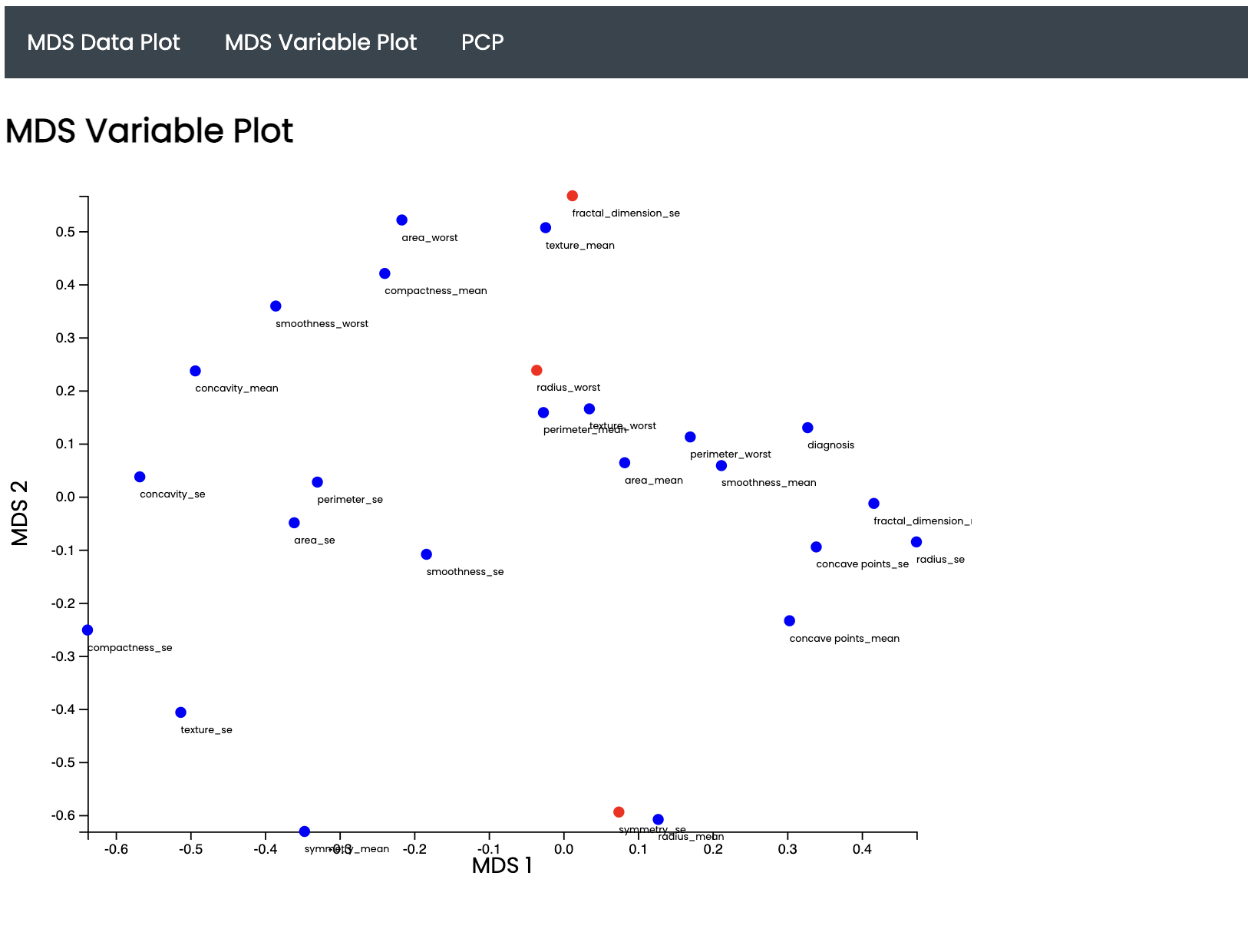
The results of the MultiDimensional Scaling are visualized here. Dimentionality reduction is performed and 31 attributes are represented on a 2D scatterplot. The first image shows MDS performed on all data points. The second figure shows a custom MDS performed on all the 31 features. The closer two features are, the more correlated they are.

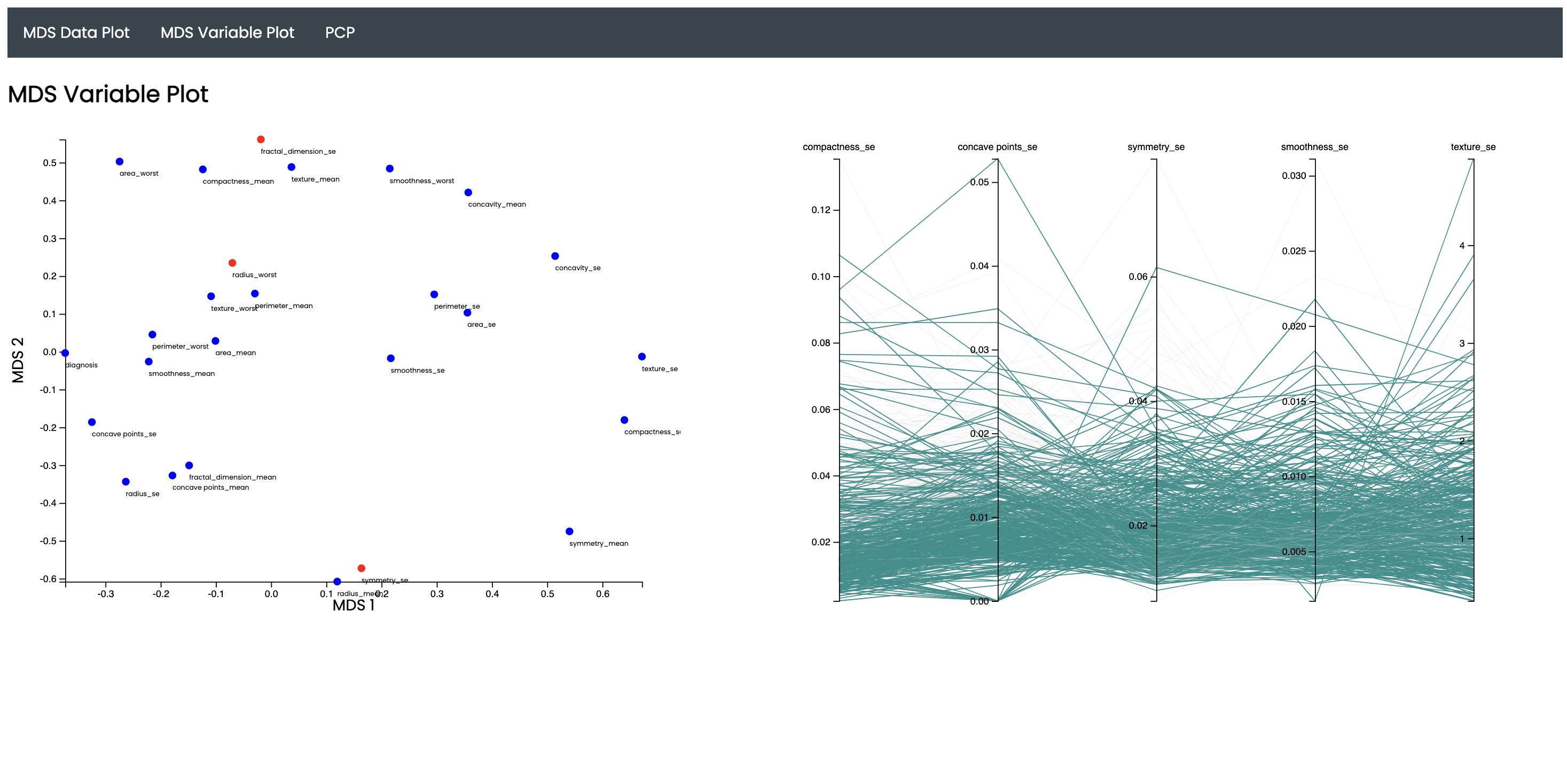
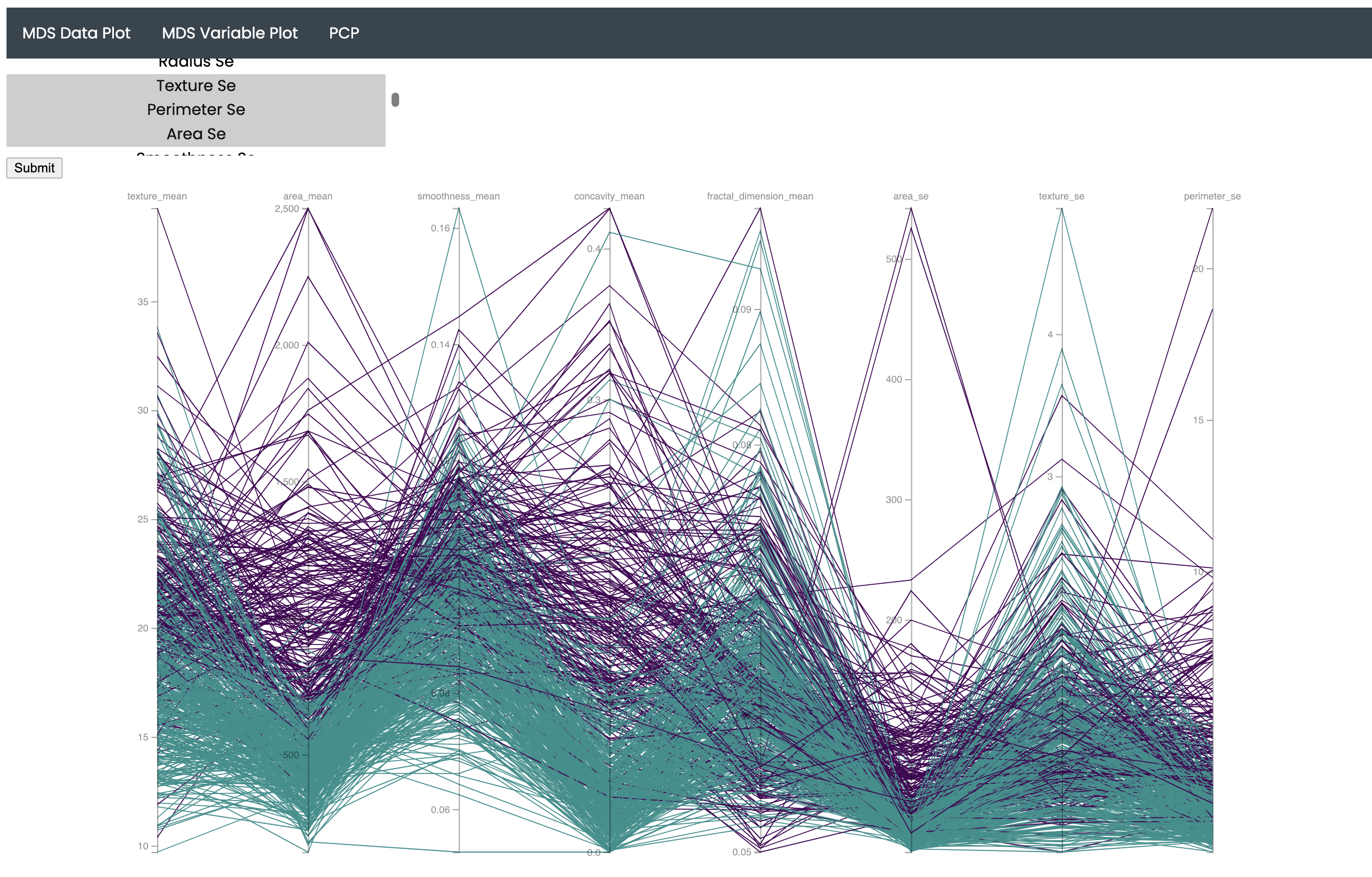
A dynamic MDS graph is shown here. On selecting 5 features from the plot, a Parallel Co-ordinates Plot is rendered on the right. The PCP gives insighful information about feature correlation

Video to the demonstration of my application!