Analysis of Breast Cancer Data - 1
Analyzing breast cancer data using Principal Component Analysis and Scatterplot Matrix
The dataset contains numerical data regarding breast cancer. It contains 31 attributes, which describe the various properties of the tumour. The label of this dataset is ‘diagnosis’, which has two labels. The tumour is either malignant or benign. Malignant indicates that it is cancerous and benign meaning that it is non-cancerous. There are 31 attributes which describe the tumour, including ‘radius_mean’, ‘texture_mean’, ‘area_mean’, etc.
I have performed Principal Component Analysis on this dataset and visualised the results using the following visualization techniques:
- Scree Plot
- Biplot
- Scatterplot
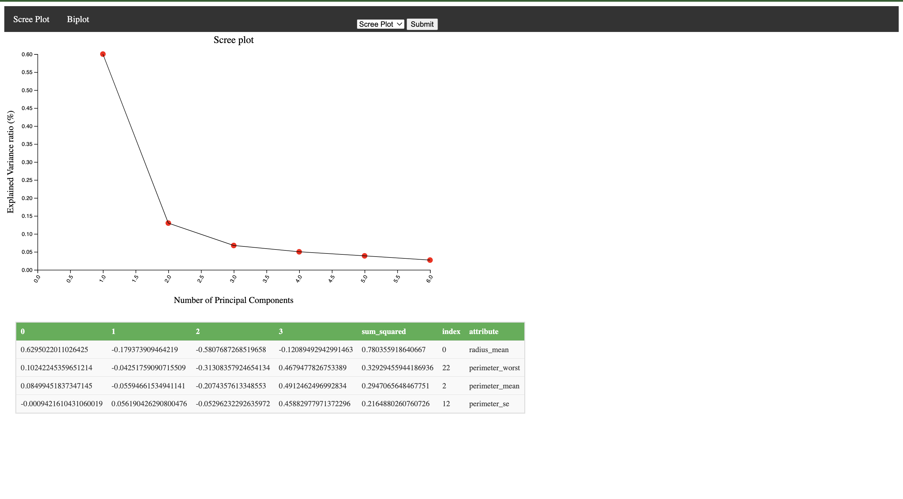
The scree plot shows the principal component on the X-axis and the corresponding "explained variance ratio (%) on the Y-axis. An interactivity element has been added on the scree plot. If a red dot is clicked (intrinsic dimensionality index(di) ), a table is generated showcasing the explained variance ratios of all principal components till the selected value. We also see the top 4 attributes of each principal component.
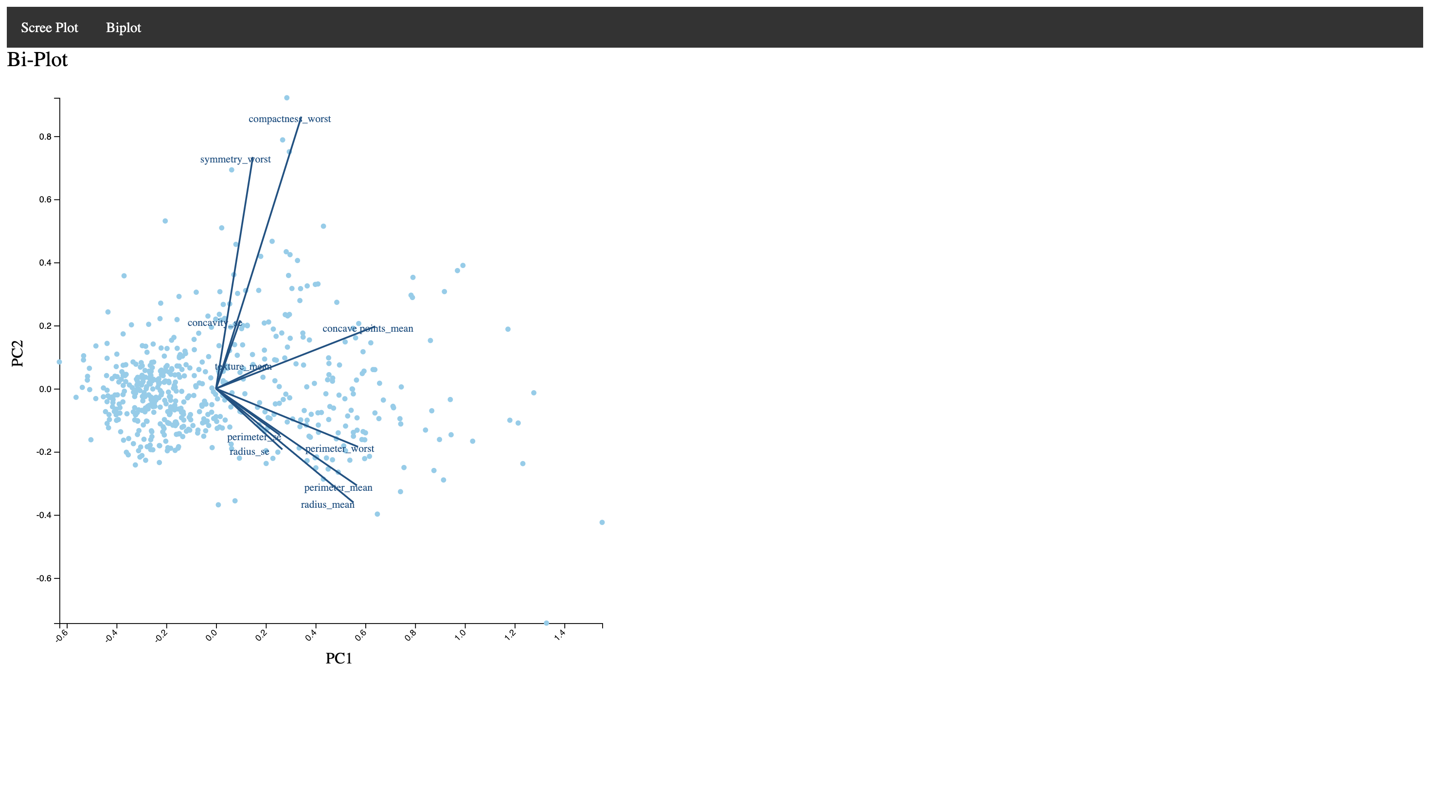
This is the biplot. The top 10 attributes are represented as lines on the PCA scatterplot. The dots on the scatterplot represent data points. The closer two axes are to each other, the more correlated they are. We get a good understanding of the correlation of attributes from the Biplot.
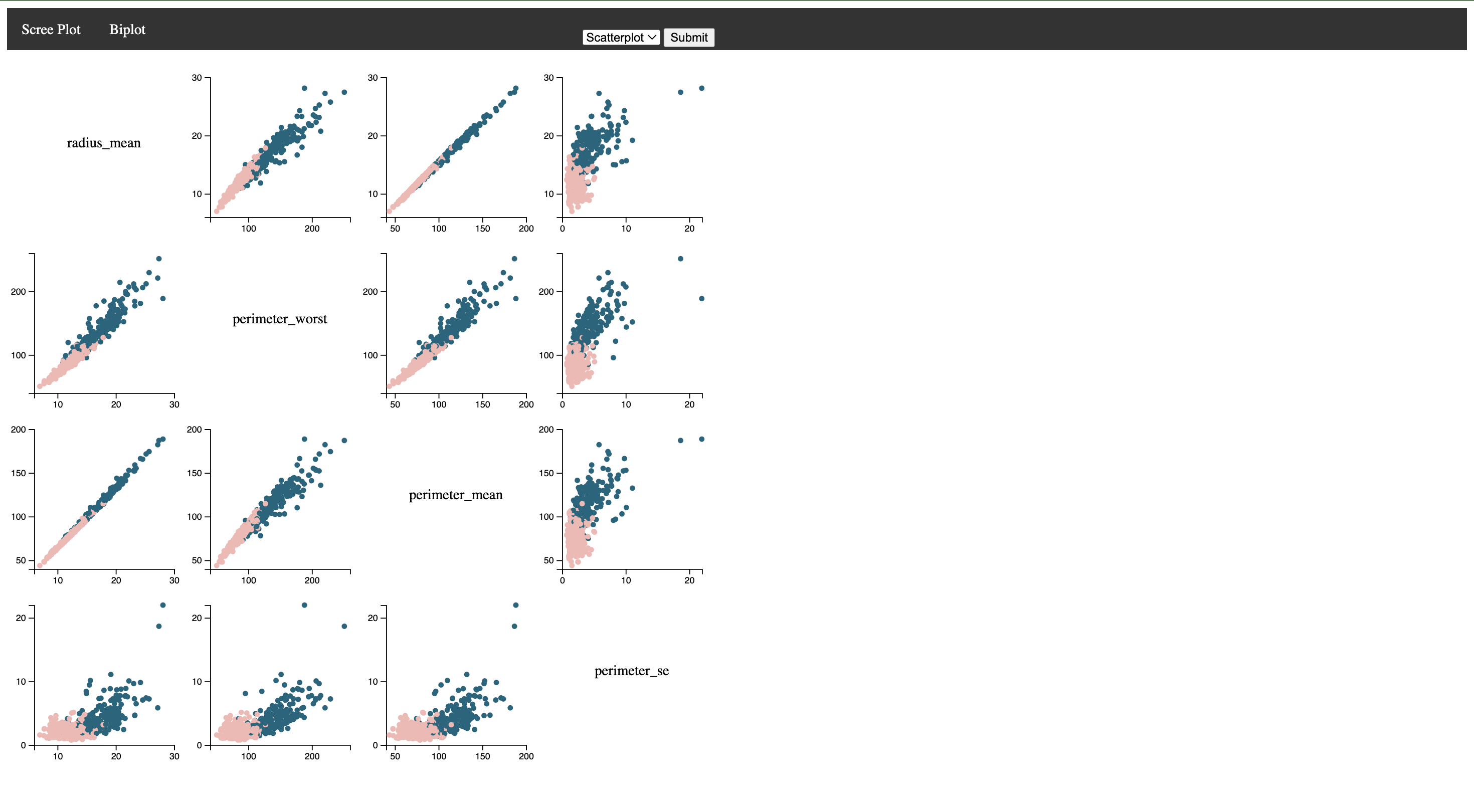
On selecting the intrinsic dimensionality index(di) in each , we get the top 4 attributes for that principal component. The four attributes are taken and a dynamic scatterplot is plotted. The four attributes are on the diagonal. The two labels are “Malignant” and “Benign”. It is color coded accordingly.


